Menu-bar popover
Start and stop timers, add notes or change labels on the fly. Quick-start rows reveal their quick labels on hover, so switching contexts takes a couple of clicks.
Features
Every part of the label model has a real surface in the app. Here's the tour — starting with the walkthrough that teaches it.
First launch
PrimeTime's interactive walkthrough hands you a live demo week and lets you break it. Group spans by any label, corrupt the charts with a bad schema and heal them again, then pick starter label sets that become real one-click timers.
Seven pages later you haven't read a manual — you've already used every idea in the app.
The surfaces
Every capture on this page is the app's own demo mode — seeded sample data, unretouched UI.
In the menu bar
Start and stop timers, add notes or change labels on the fly. Quick-start rows reveal their quick labels on hover, so switching contexts takes a couple of clicks.
In the PrimeTime window
Saved label sets as one-click cards — icons and colors for the way you actually organize work. Sets that are already running light up.
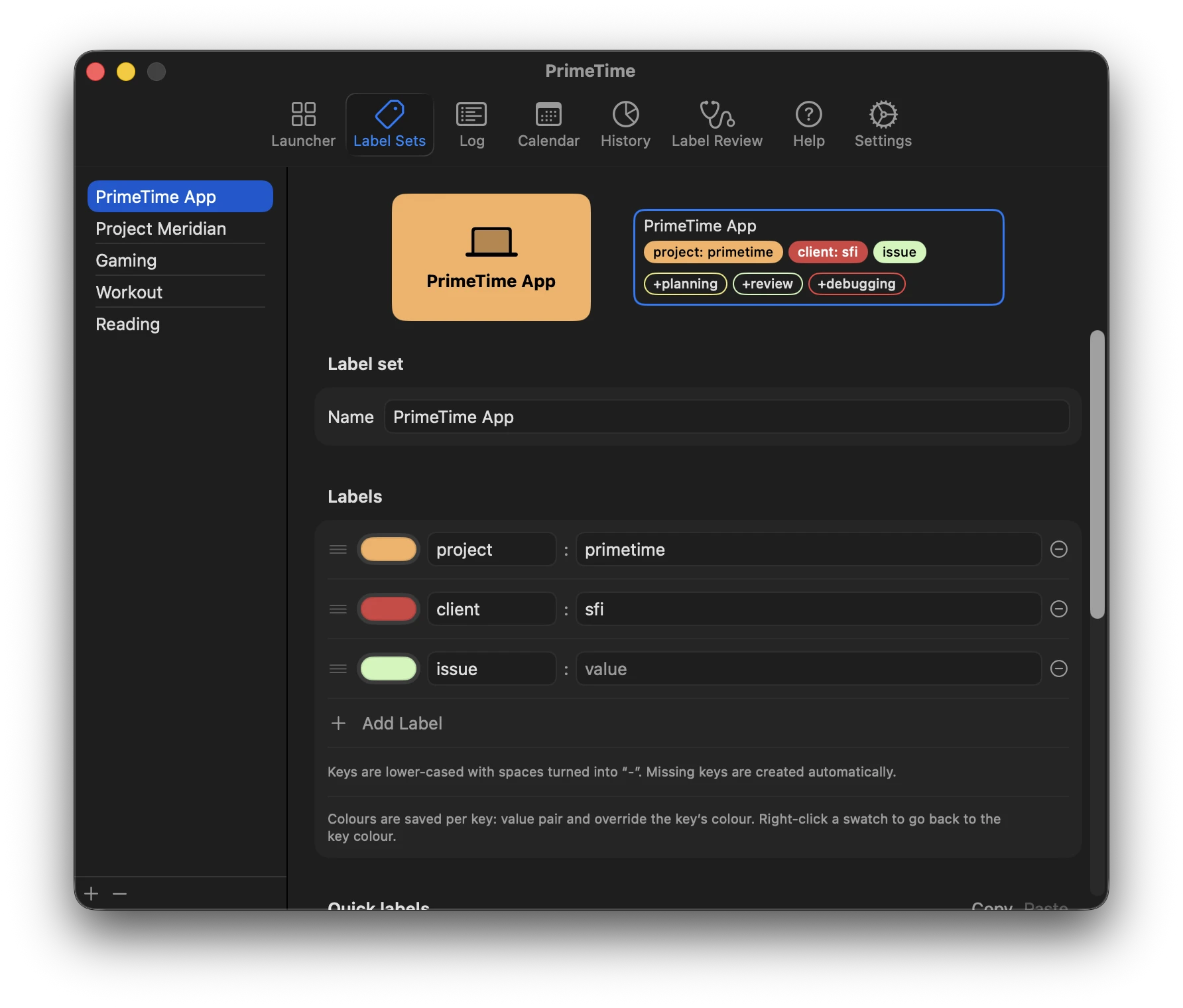
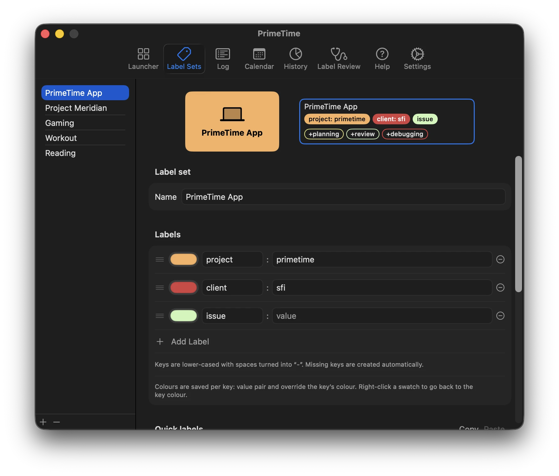
Name and edit the sets behind one-click timers. Set up quick labels to fit your workflow, and give every key: value pair its own color.
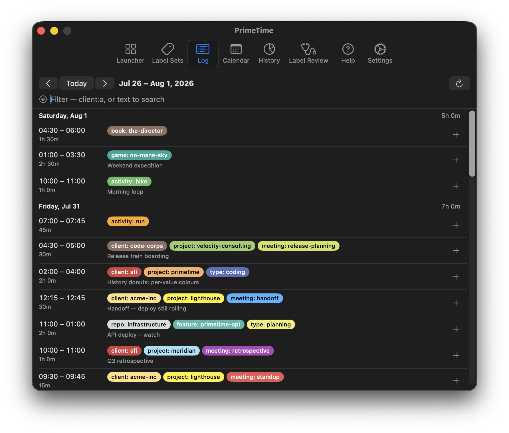
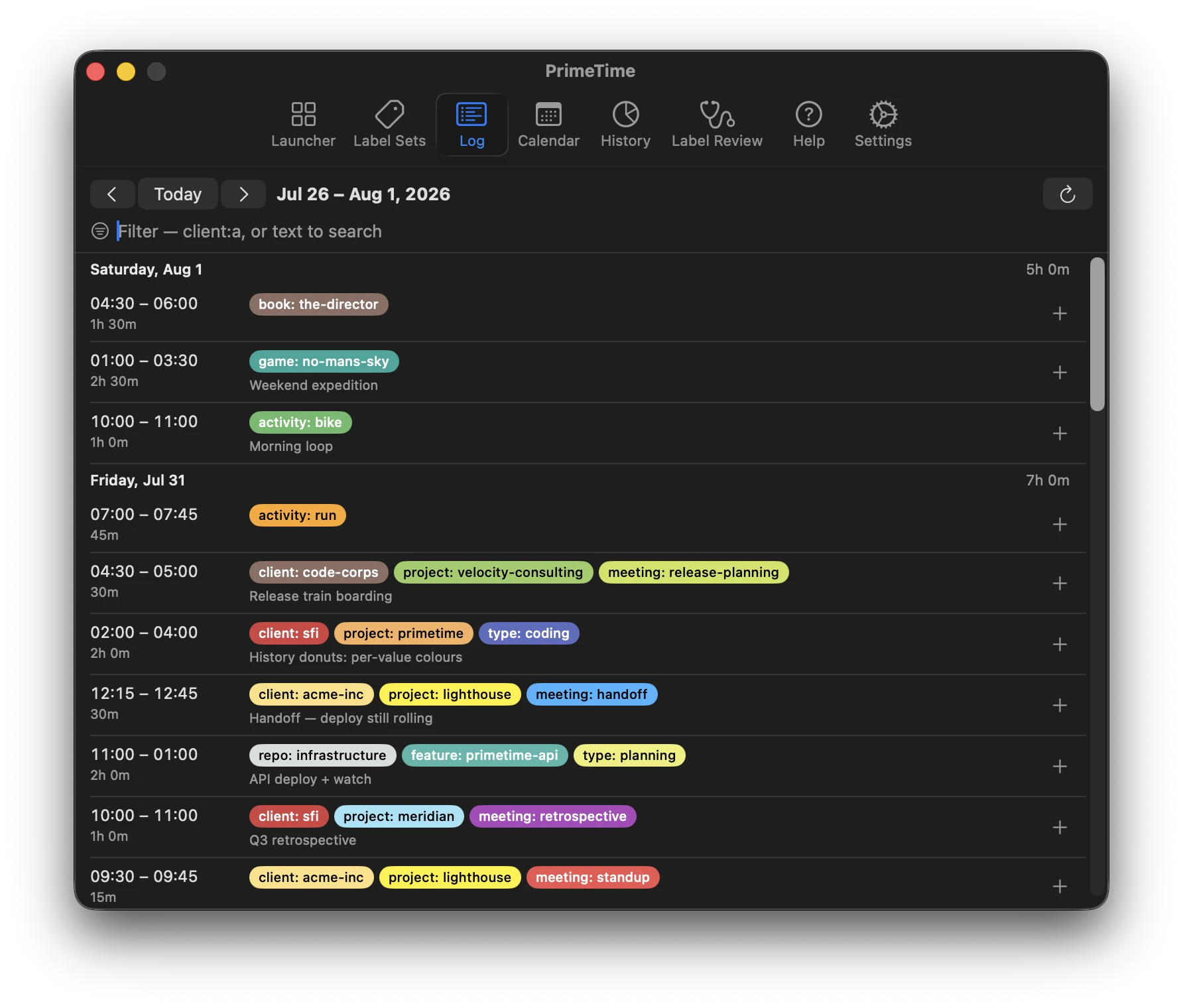
Review and freely edit timespans after-the-fact: because real work overlaps, gets interrupted, and needs correcting.
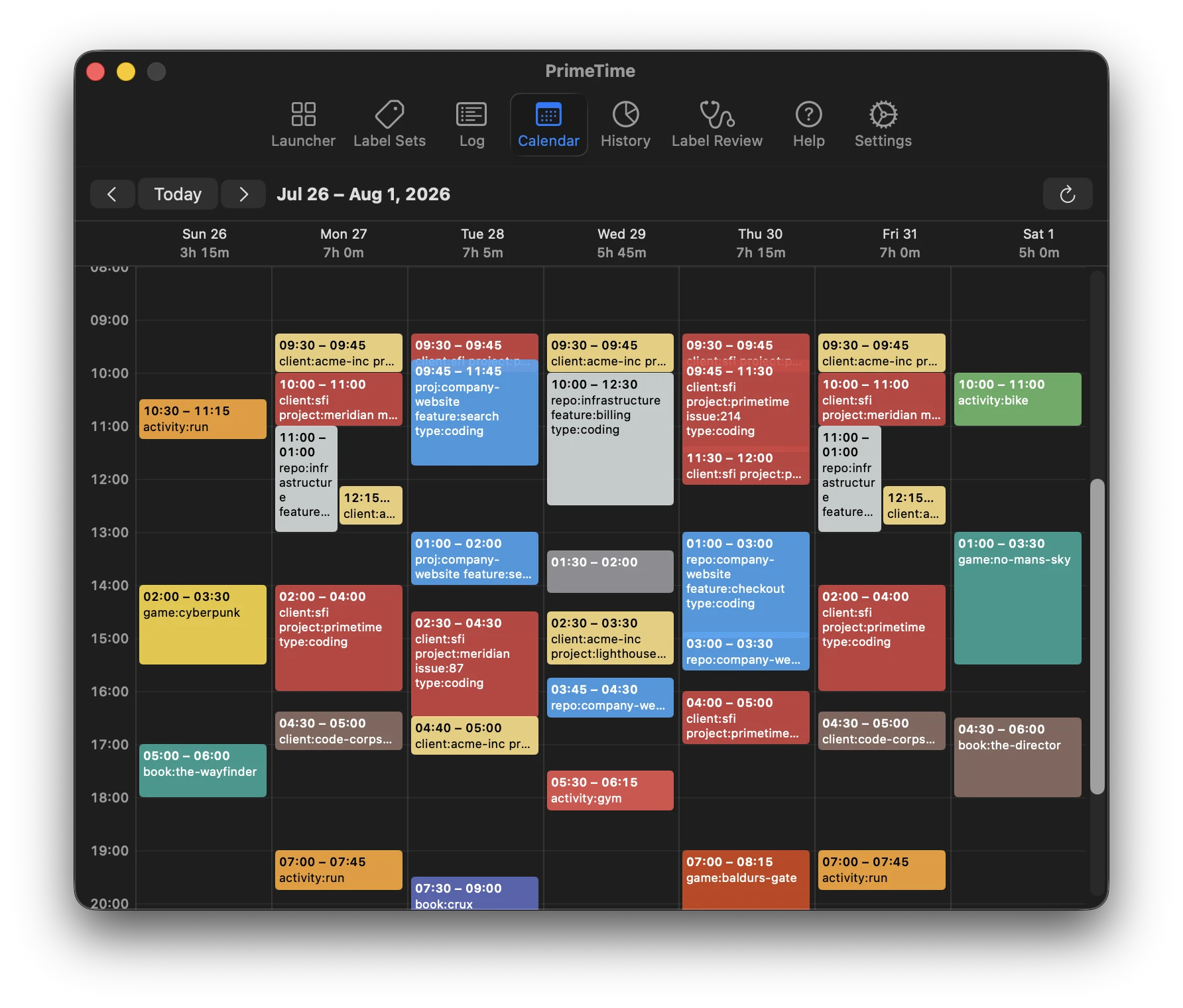
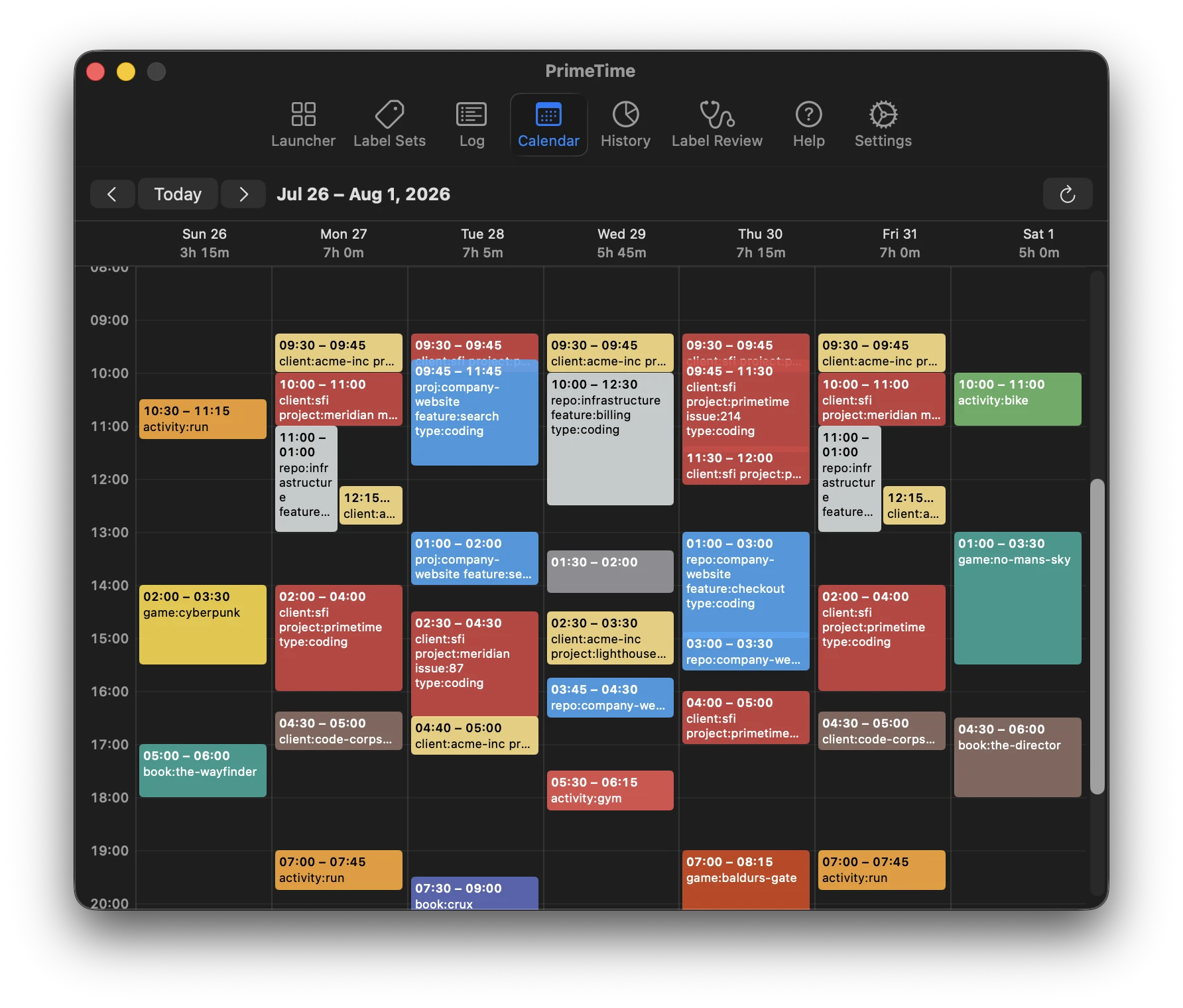
Your week laid out hour by hour. Overlapping timers share columns, so multi-tasking is visible instead of hidden.
Visualize your timespans with group-by based aggregations — pick any label key and see where the week actually went.
Merge drifted keys and stray values. With PrimeTime it's easy to catch these outliers and correct them before they impact downstream.
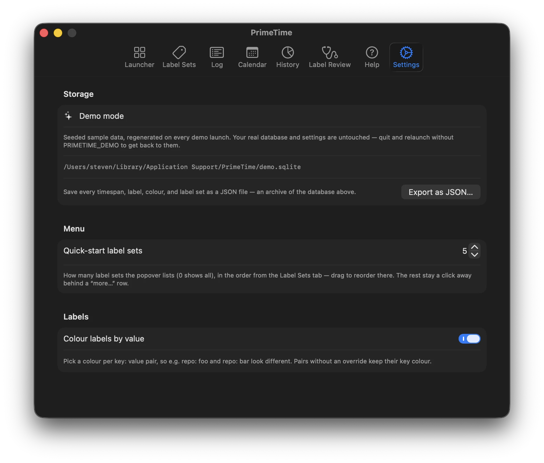
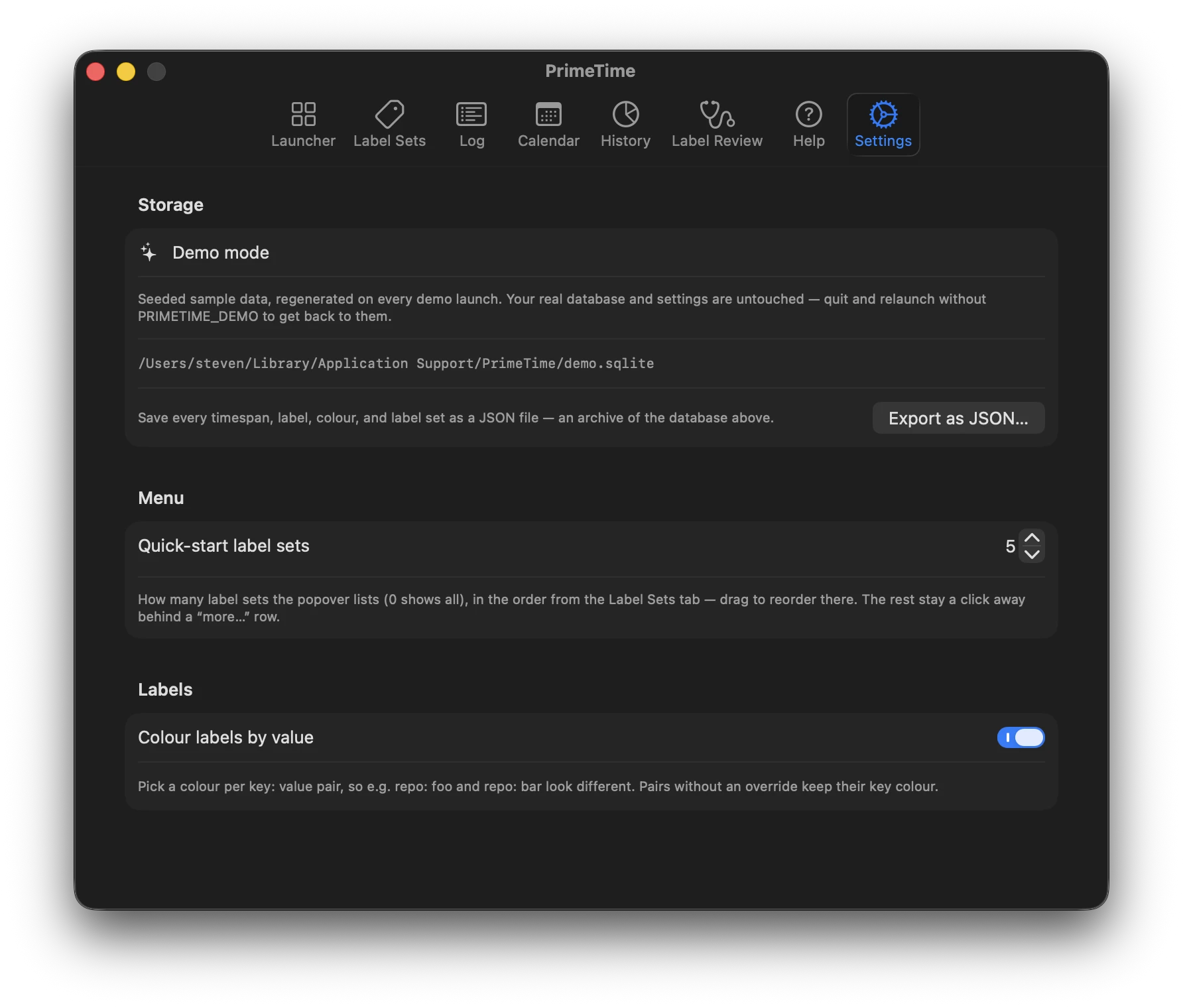
Sync, colours, and everything else. Local-first storage with one-click JSON export — and a demo mode that never touches your real data.
Everything above works locally from the first launch — no account, no server, no setup.